Hundredrooms: conversion optimization
Responsive web ― Travel start up
INDUSTRY
Travel start-up
YEAR
2019
ROLE
Product manager
PLATFORM
Responsive web
LINK

This is the story of how we redesigned the cards on the search result page in a travel website resulting in + 6 % of conversion rate.
Role: product manager
Context
Hundredrooms is a metasearch site that compares vacation rentals all around the world in a single search, saving the user time and money on their travels. It aggregates properties from key partners such as Airbnb, Booking.com, Expedia, Tripadvisor, Homeaway and many more. Although Vacation Rentals are its core business, Hundredrooms also compares hotels and other short-term rentals. The business model includes a revenue stream each time a user books an accommodation on one of the partners’ sites.
The business goal of this project was to increase conversions on our core product by improving the usability of the ‘property cards’, or the way the user interacted with the accommodations on the results page.
Problem & hypothesis
The property cards are a key part of the product. They need to motivate and drive the action to click and book the property at our partner’s site. We want the user to understand the information displayed, to be able to compare between cards easily, and ultimately to achieve their goal when they’re looking for accommodations at Hundredrooms. The property cards are the first thing users see when they make a search, so they need to contain the most relevant information, as space is limited.
A user test gave us some insights about the property cards that we needed to investigate further quantitatively and qualitatively. We used Hotjar to spot heatmaps and how the user behaved and moved through the results page. We also analized data from our internal database to measure quantitatively the different click sections CTR and click share and conversions from each section of the page (cards, map or others).
From this data, we developed a hypothesis: we believe conversions will increase if users who are most sensitive to comparison successfully compare prices and conditions with a clearer structure of key information.
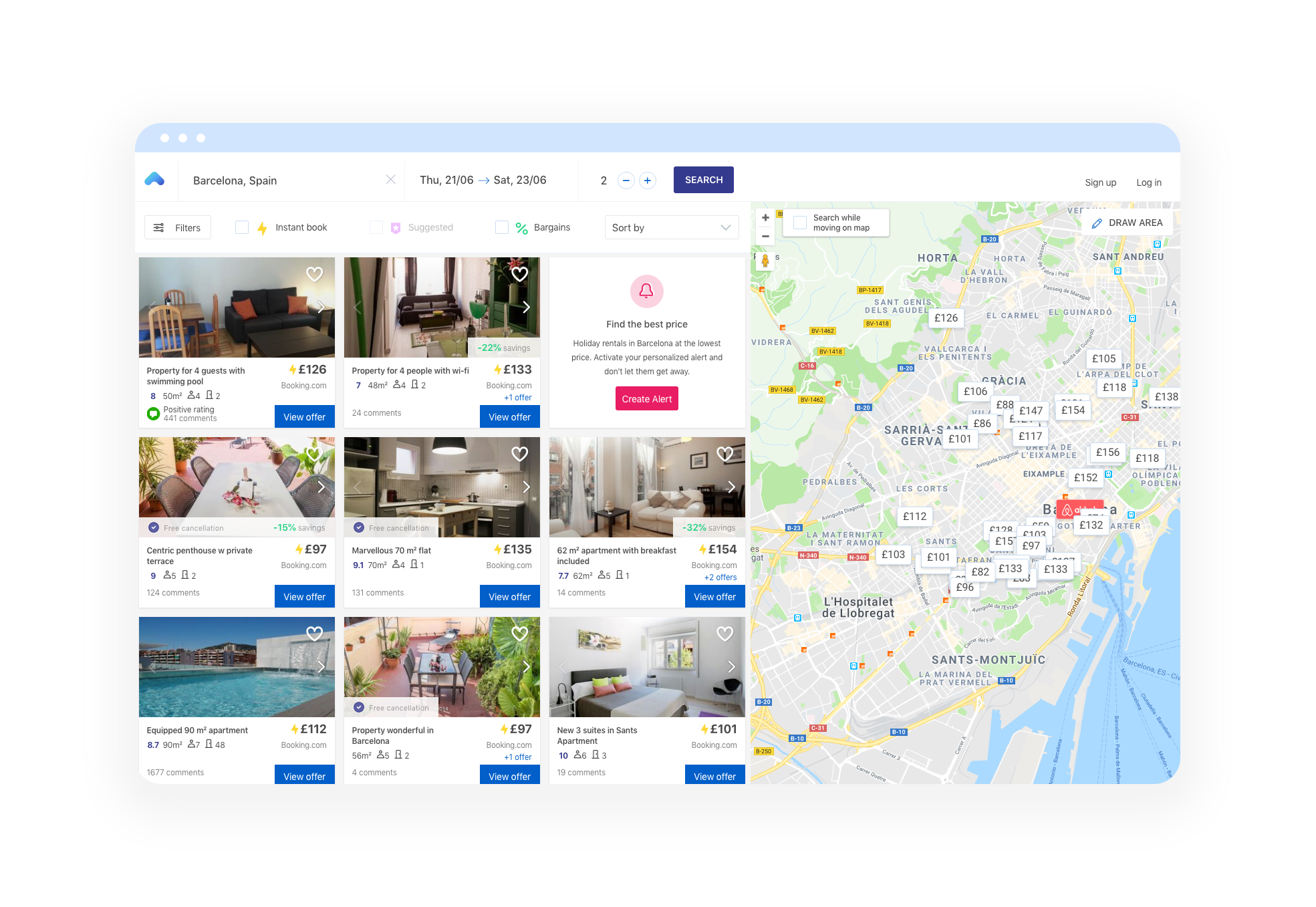
- Too many distractions over images.
- Instant booking icon not clear enough.
- Rating as a decontextualized number, incoherent with the partner’s rating.
- Rectangular, small CTA with a low click through rate.
- No indication of the typology of accommodation.
- Titles that are not relevant for the user.
Process
First, we gathered some data insights to generate the hypothesis, then we moved to designing and building the experiment. Afterwards, we measured the results and did several iterations, measuring and learning after each one.
Solution – First iteration
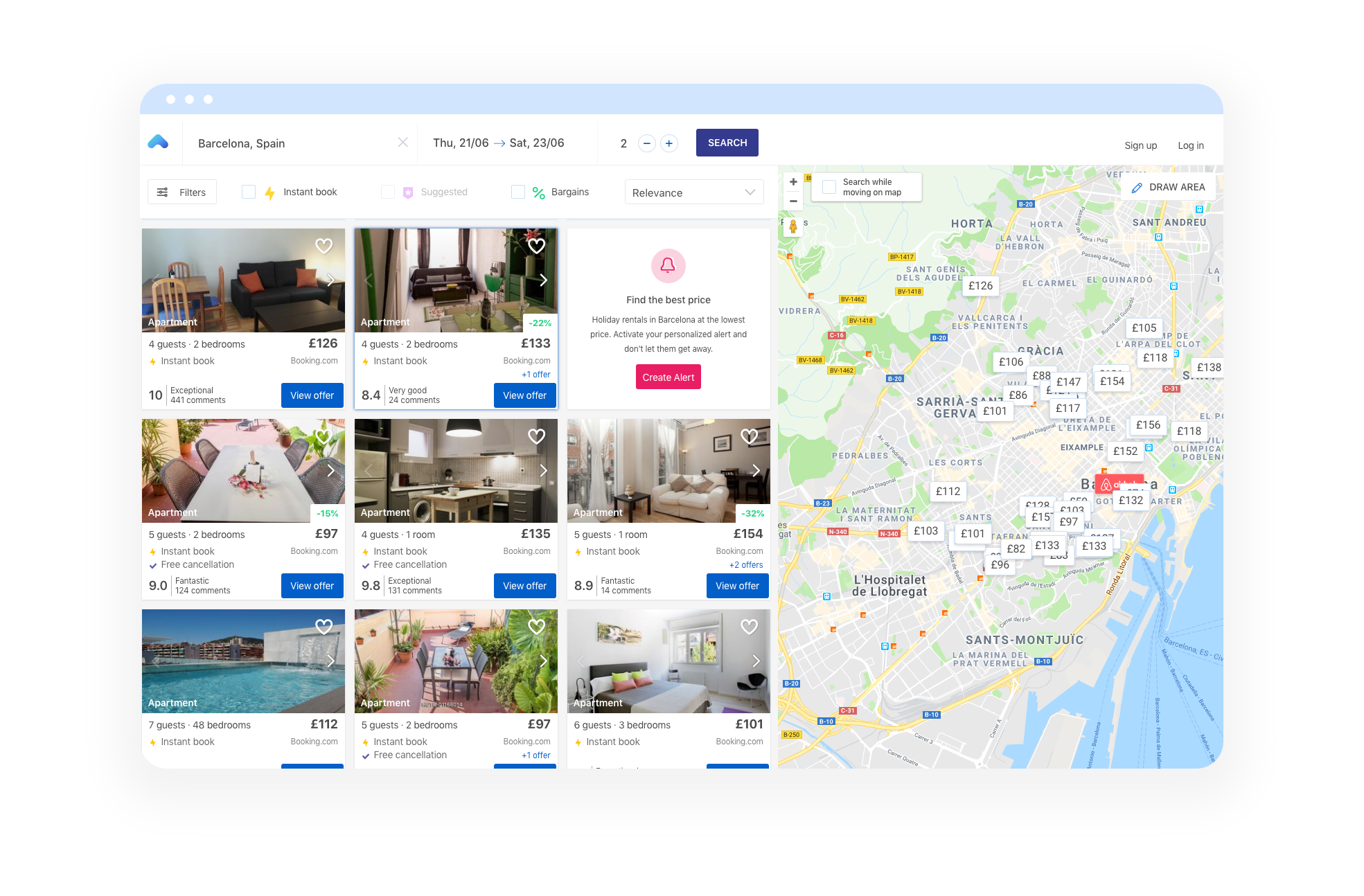
We did an AB test comparing the current version of the cards with the new redesign, with a split of traffic of 50% and initially in 3 markets.
On the first iteration we implemented a new rating design, changed elements over images, included typology of accommodation, removed titles, included clarification copies, removed less relevant information, increased size of cards vertically.
- Less cognitive effort: only key information.
- Clear property type
- Instant booking and cancellation icons recognizable and explained to the user.
- Clear rating, with positive reinforcement adjective.
- Bigger CTA, less rectangular for comfortable clicks.
However, there were still some issues with the first iteration that we had to tackle
- Legibility issues on elements over images.
- Hotel titles are cropped.
- Metasearch site not clear enough.
- No brand recognition incentive.
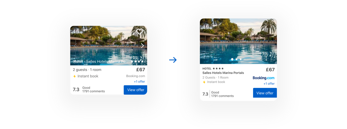
Solution – Second iteration
After realizing there were some issues, we performed another test with a new iteration on the design
We increased the size of images, cleaned the elements over the images to reduce the cognitive effort, changed placement and capitalization of type of accommodation, included partner’s logos, and increased CTA size.
- Legibility issues solved.
- Clear hotel titles and stars (Hotel chain brands).
- More visual (easier to compare results).
- Recognizable brands with logos.
Conversion rate on our core product increased 6% thanks to the redesign of the multicard experience.
The next steps planned were to get specific feedback from users using Hotjar widgets, where users can point out to specific sections of the page, and test alternatives that challenged some of our core product assumptions (for example, a more inspirational search result page).