Increasing user activation through UX improvements at Bling
App ― Fintech
TYPE
In house (Fintech app)
YEAR
2021
ROLE
Product designer (UXUI)
PLATFORM
Mobile app
Our starting point
BLING is a fintech app that advances users up to 100€ free of interest. BLING’s mission is about helping users be more financially healthy and reducing the stress of those struggling to make ends meet. On the product team, we were constantly working on improvements that made our experience helpful and clear.
1.
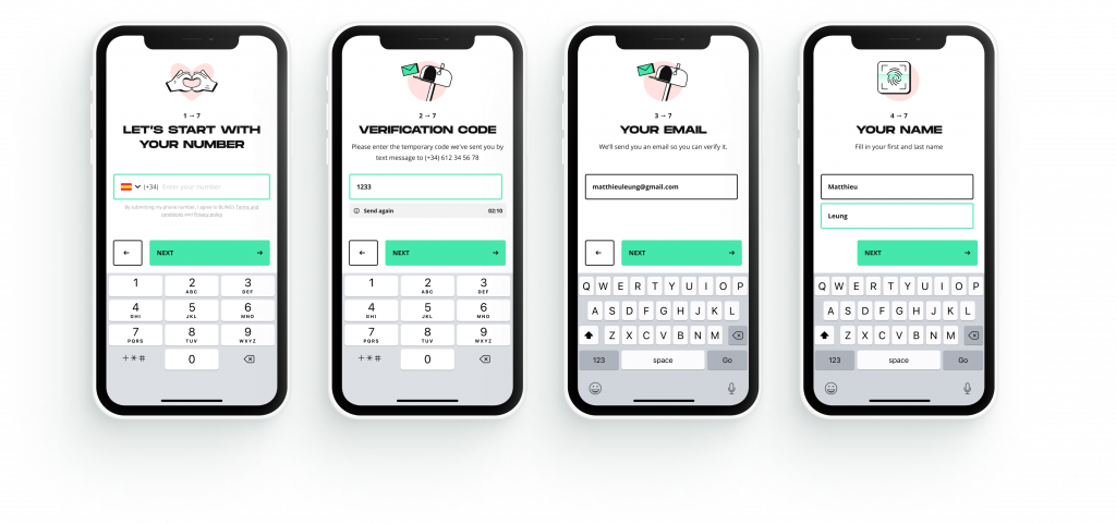
Thanks to user feedback, we learned that the Aha! moment happened too late on the flow, with much upfront effort on the user’s side during sign up. They had to go through the full sign up process before realizing the benefits of the app, which was off-putting for some.
2.
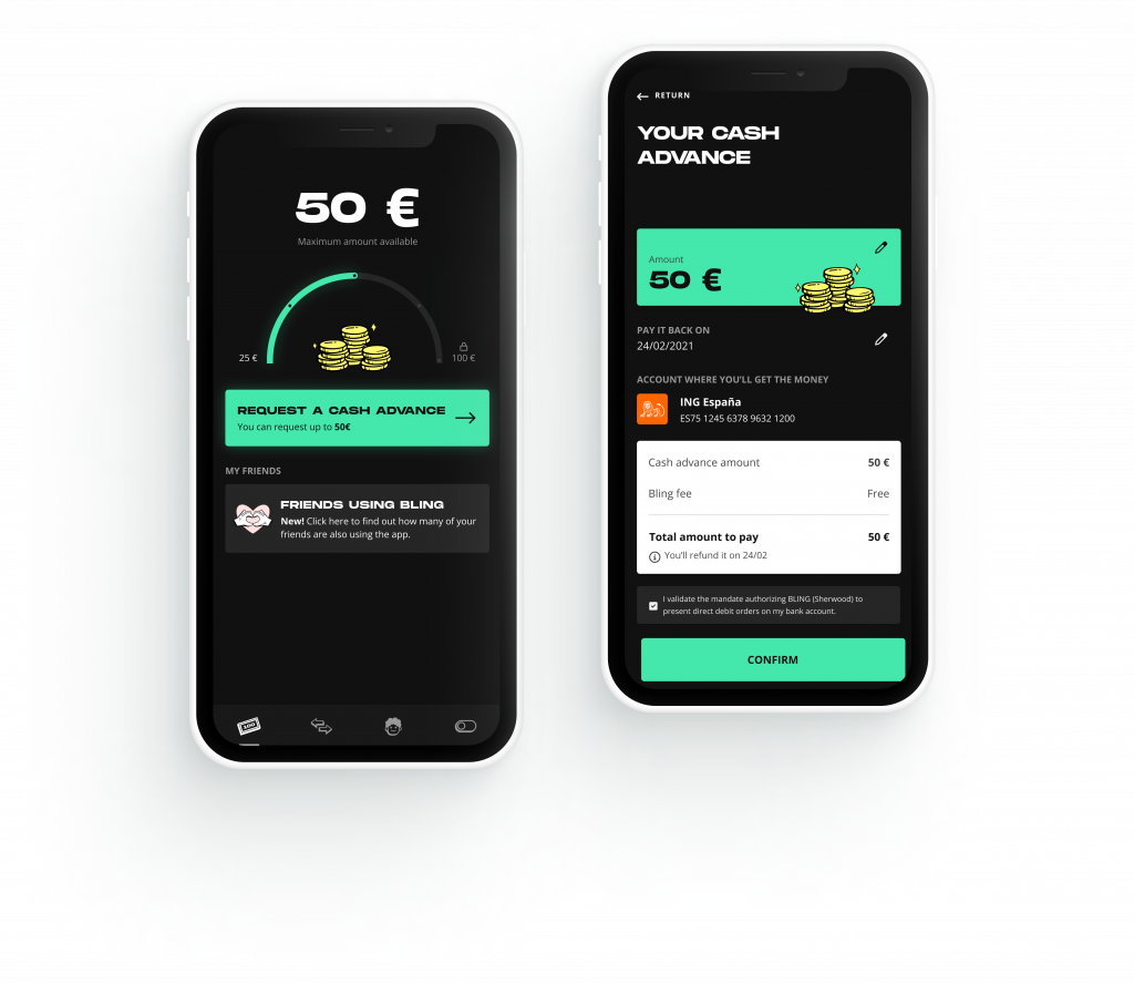
We wanted to improve the path to the first cash advance to make it as straightforward and fast as possible, and also set the right expectations for a first time user regarding how the app worked and possible constraints.
Process
My role was designing improvements on each specific touchpoint for the pain points that were causing a drop off: whether it was the bank connection step, creating the account, verifying identity, etc. For this, I had to understand the user’s fears and worries and address them in the UX, so I collaborated closely with product managers, customer success and marketing to better understand them. From user interviews we gathered some insights for key points on the flow.
From these user insights we kicked off our design sessions. It also took some design research to move forward, including analyzing other apps and usability heuristics. Then we moved from generating ideas to final high-fidelity prototypes that were later AB tested and either rolled out or iterated further.
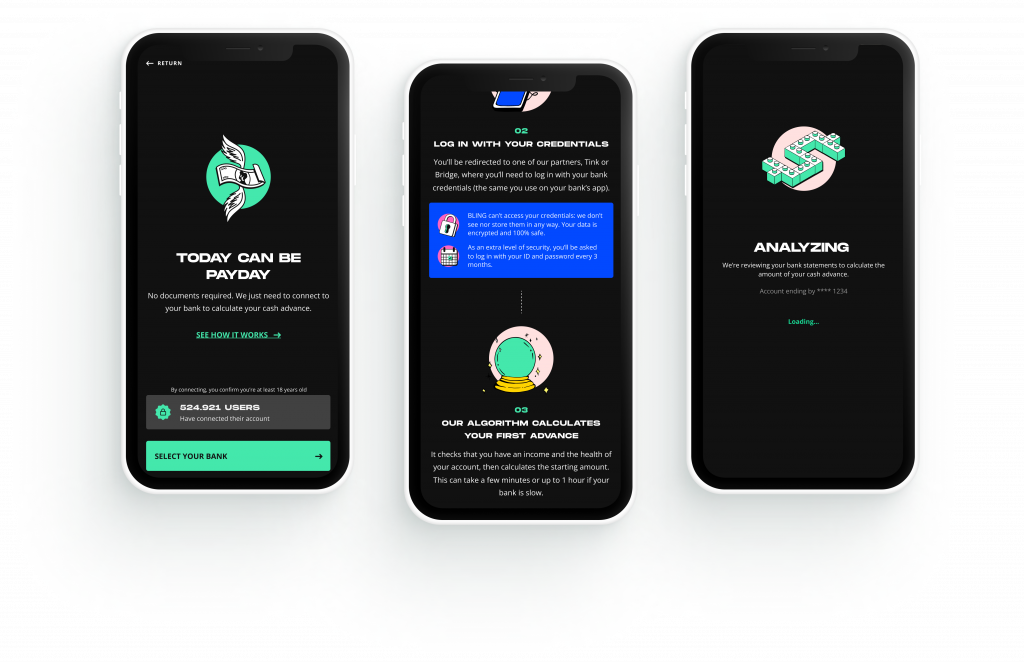
One of our biggest themes was trust: as the user needs to enter their bank information, it’s important that we create an experience in which they feel comfortable and safe doing so.

Finding a better way to welcome users
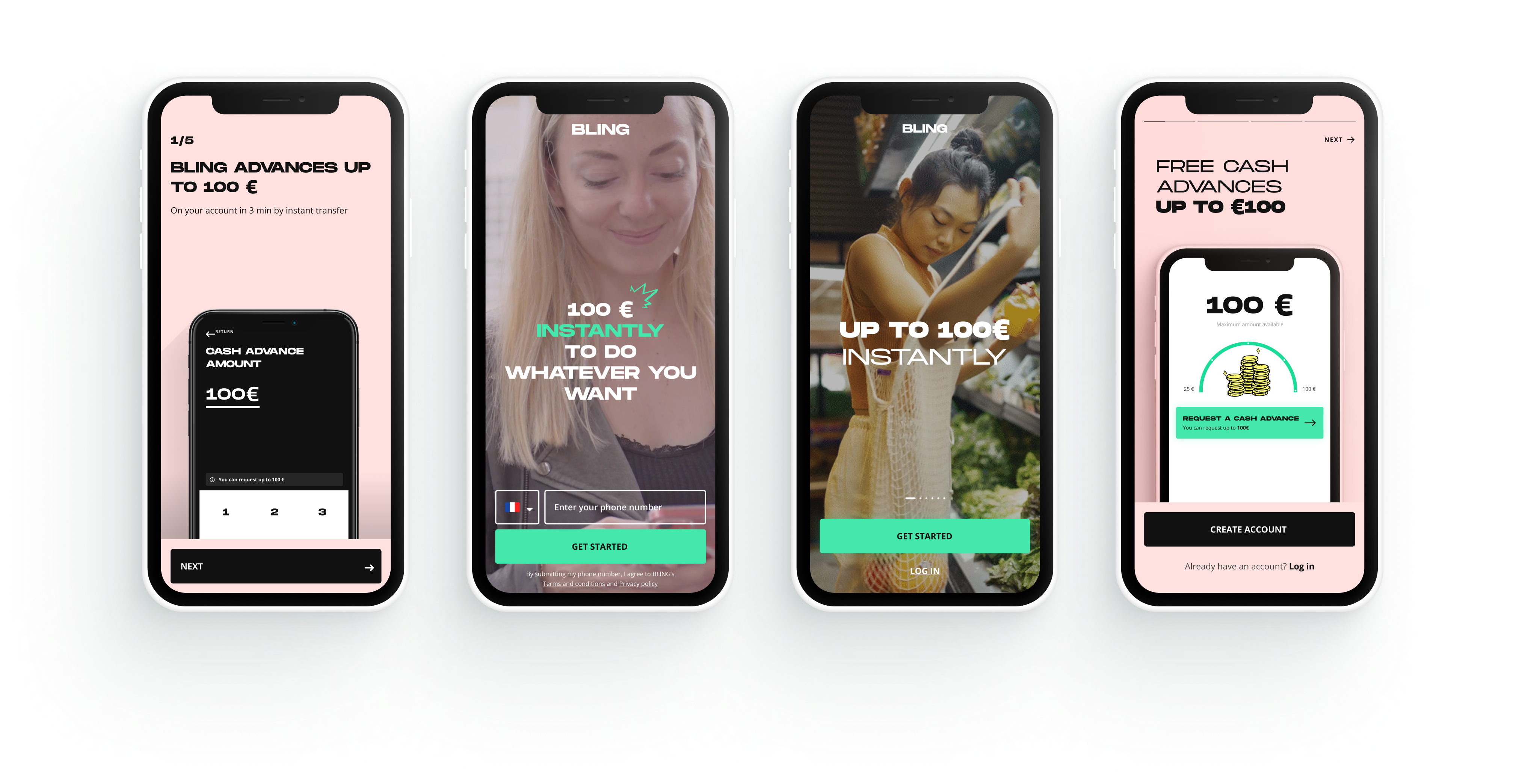
We iterated the onboarding screens during months to better convey the value proposition, reflect the right brand values and set the right expectations on how the app works (from video background to app previews, from swipe interactions to story-like automatic interactions).
Simplifying the path to the first cash advance
And changing the order of some steps to help them realize value as soon as possible, as well as requesting the cash advance as fast and easy as possible.

Usability improvements
We included usability improvements such as reducing unnecessary requests of information from the user and improvements in error prevention. It was essential as well to give better visibility of their status through the flow and clearer feedback.