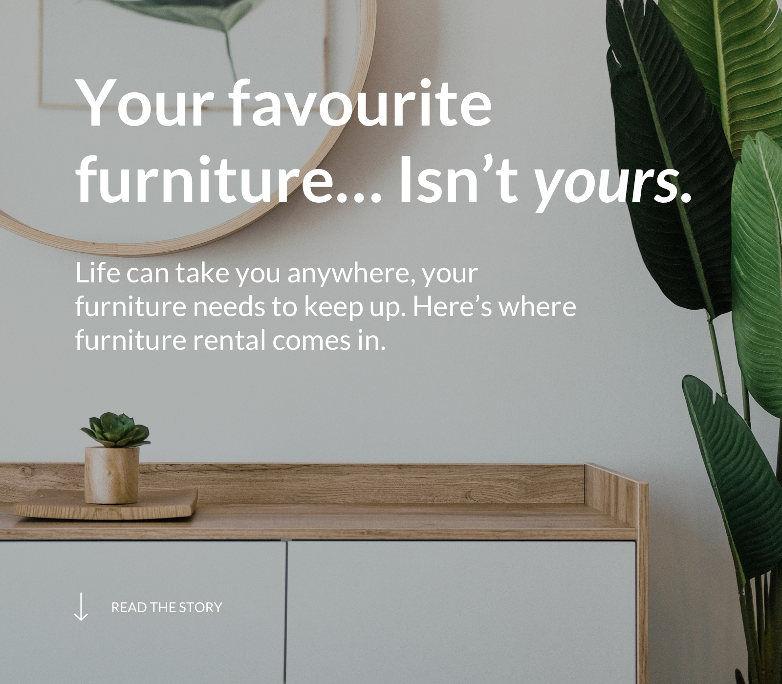
Furniture that keeps up.
Product design case study for an e-commerce experience.
TYPE
Personal project
YEAR
2020
ROLE
Product designer (UXUI)
PLATFORM
Responsive web
Context
The idea for Norkiwi came up as I recently experienced the pains of moving to a new apartment where only the kitchen and bathroom are furnished (although as someone who has moved more than 6 times in her life, these past experiences contributed to the idea as well). I was having trouble trying to find pieces that were affordable, matched together, fit in the space, and didn’t have the typical mass-produced look. Weeks went by and I couldn’t decide because buying furniture was a commitment itself. After some research, I was able to frame the problem.
With increasing mobility, a climate of economic uncertainty, and a low percentage of young people being able to afford buying their own place, there’s a strong need for flexibility in living options.
Problem & Hypothesis

Mobility has increased, and in a climate of economic uncertainty. Also, the rise of home working has stressed the importance of having a proper set up to work from home, even if it’s temporary.

Furniture is expensive, specially if you care about design. And getting rid of furniture you don’t want or use means effort and cost.

Buying furniture itself is a commitment. Moving becomes overwhelming and expensive.
Process
Research
Discovery interviews, competitors analysis, survey, defining success metrics & value proposition.
Ideation
Using user personas, jobs to be done, user journey tools. Iterative with new learnings.
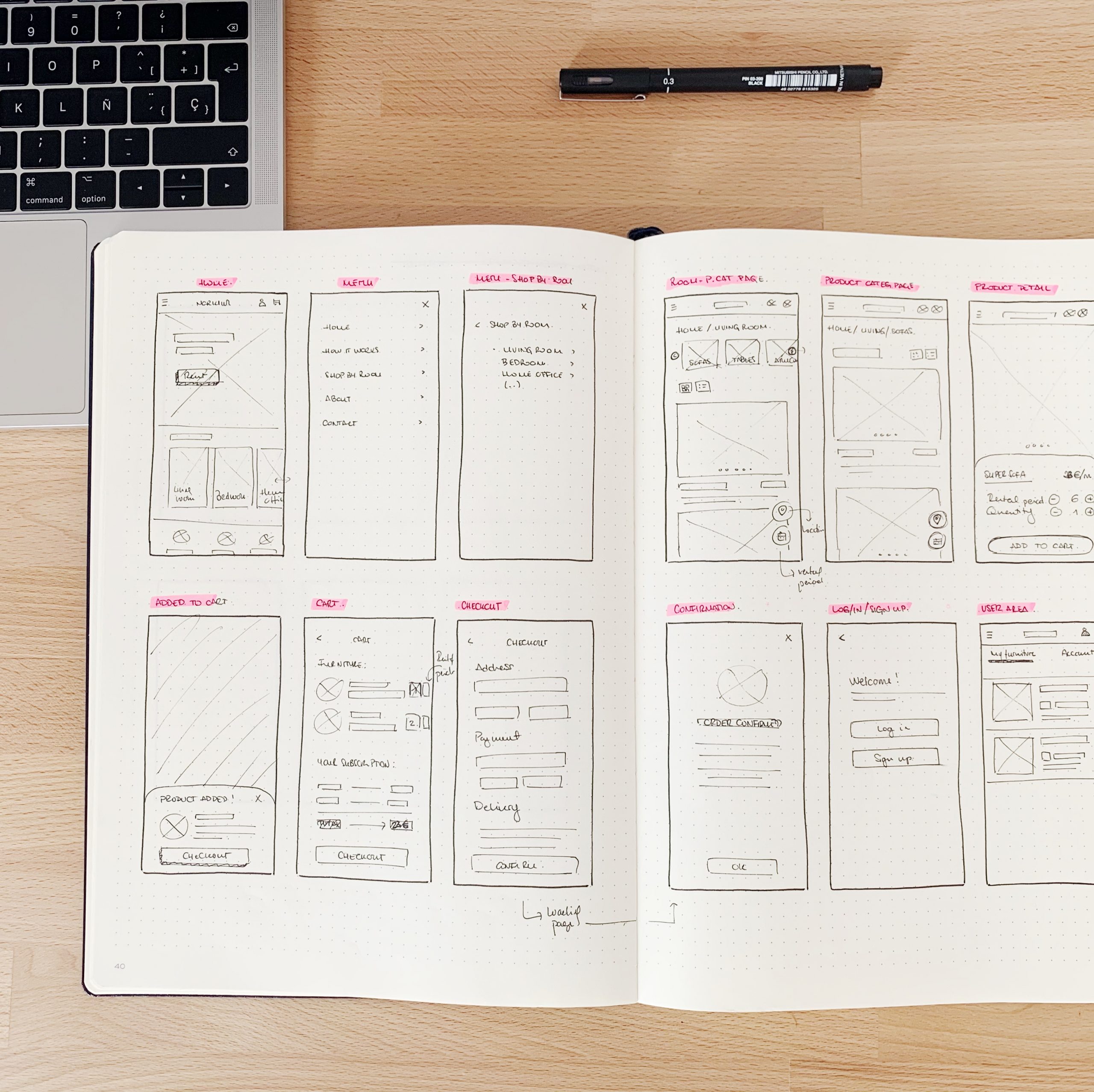
Low fidelity wireframes
Sketching full flow, with iterations based on research.
High fidelity wireframes
Branding, high detail interface, iterative prototype with iterations based on research.
Iterations & testing
Testing and measuring the outcomes.

Research Insights
First I did some market research and benchmark and found several existing solutions, most of them operating in New York City. Some of them lacked the flexibility that I had in mind, were expensive or did not communicate properly the value proposition.
However, I had to validate my assumptions and identify the needs and key pain points of the potential users with research. As I’ve had much mobility myself, I approached people in my network who I knew had experience on moving as well, and did a survey to further validate in a more quantitative way.
Design is an important factor, almost as much as functionality
But originality is not valued as much. It’s more about the flexibility and the price. When user travels a lot and moves a lot, they don’t care as much about the quality, originality, nor eco-friendliness, but care the most about price and functionality and value high flexibility.
70% have had to give away or sell furniture when moving
There’s a great mobility among millennials: 71% of people between 25-35 has moved 2-5 times in the past 5 years. Almost half consider their biggest dislike about owning furniture the fact that moving becomes more difficult or not knowing what do do with if if they move.
Browsing online first and social proof
Browsing online helps you narrow down what you like and saves time when you’re searching, can access a wider catalogue and allows you to compare prices. Also they care about reading customer reviews beforehand, as it helps them choose.
People prefers to see the products physically first
But 53% browse online, but then go to the store physically to buy it. Since it’s a big expense, they need to make sure it matches what they saw on the website and what they had in mind. Also, it’s a way to check for quality, colors, etc. Also, some believe getting furniture delivered is usually expensive.
Quotes
“Normally I forsee how many years I will stay on that place and I buy the quality of them accordingly (I am willing to spend more money or not).”
“In this area we buy lots of second-hand furniture. There’s many people that comes to live here 1 or 2 years (or even less) and you’ve got to always buy the furniture because most houses are rented without any. Normally we use FB groups or apps where they sell second-hand furniture in a good state. People usually take good care of their furniture to resell them when they stop liking them or they need to move.”
“Browsing online will help narrow down what I’d like to look at, but ultimately, it could look/feel different in person given that I’m not particularly interior design savvy and not accustomed to all the details that an online store would provide.”
Value proposition
With the insights obtained, I worked on the value proposition canvas to map the pains, gains, and start generating ideas on features and services that could meet the needs of the target users.
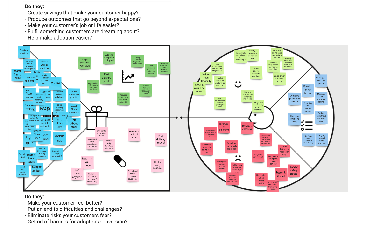
Prioritization
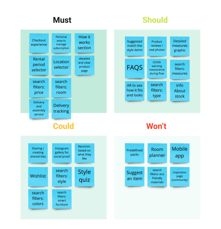
To be able to create a solution that delivers value to the customers in the shortest time possible and get feedback and start learning, I had to prioritize and decide what my first version was going to look like. I would have used the value / effort matrix, but since I didn’t have the point of view of a developer to be accurate with the effort, I decided to use the MuSCoW method to prioritize relatively among solutions, considering estimated value to the customers and estimated ease of development.
For example, in my research I discovered seeing the product physically and how the product looks and feels in the room influences the decision a lot, and an AR feature that lets them view the product in their room would be a delighter for them, but it’s likely it has a really high development cost and would delay getting the product into the hands of the users as soon as possible.
I revisited this step as I learned through the project and new circumstances came up. For example, when COVID appeared, it’s likely health safety is an issue that could put off users from renting furniture, so I had to reinforce the measures to protect them.
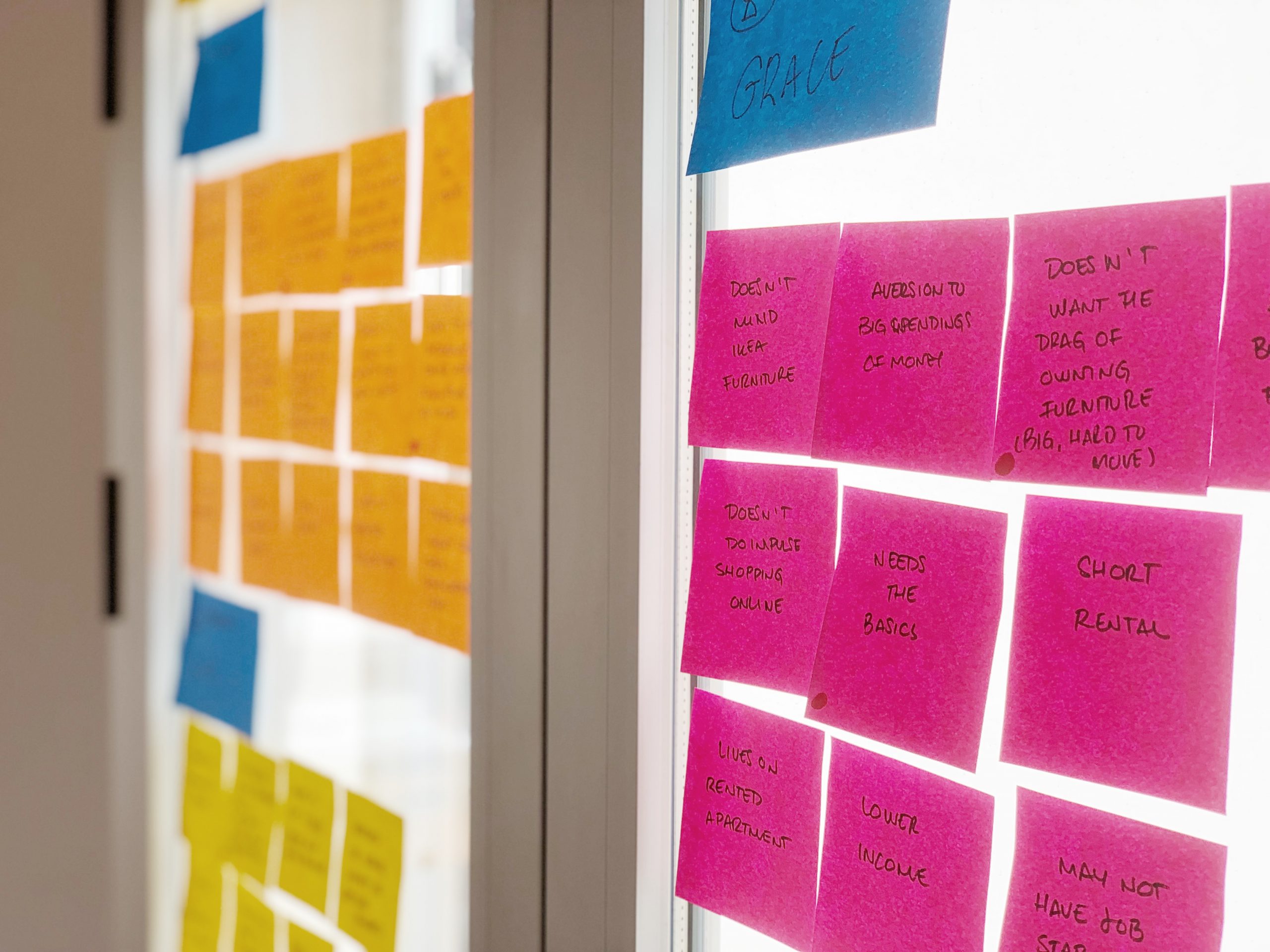
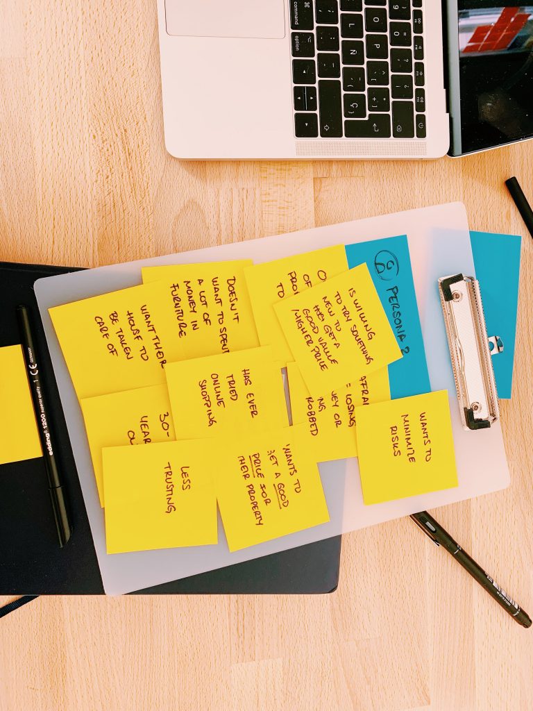
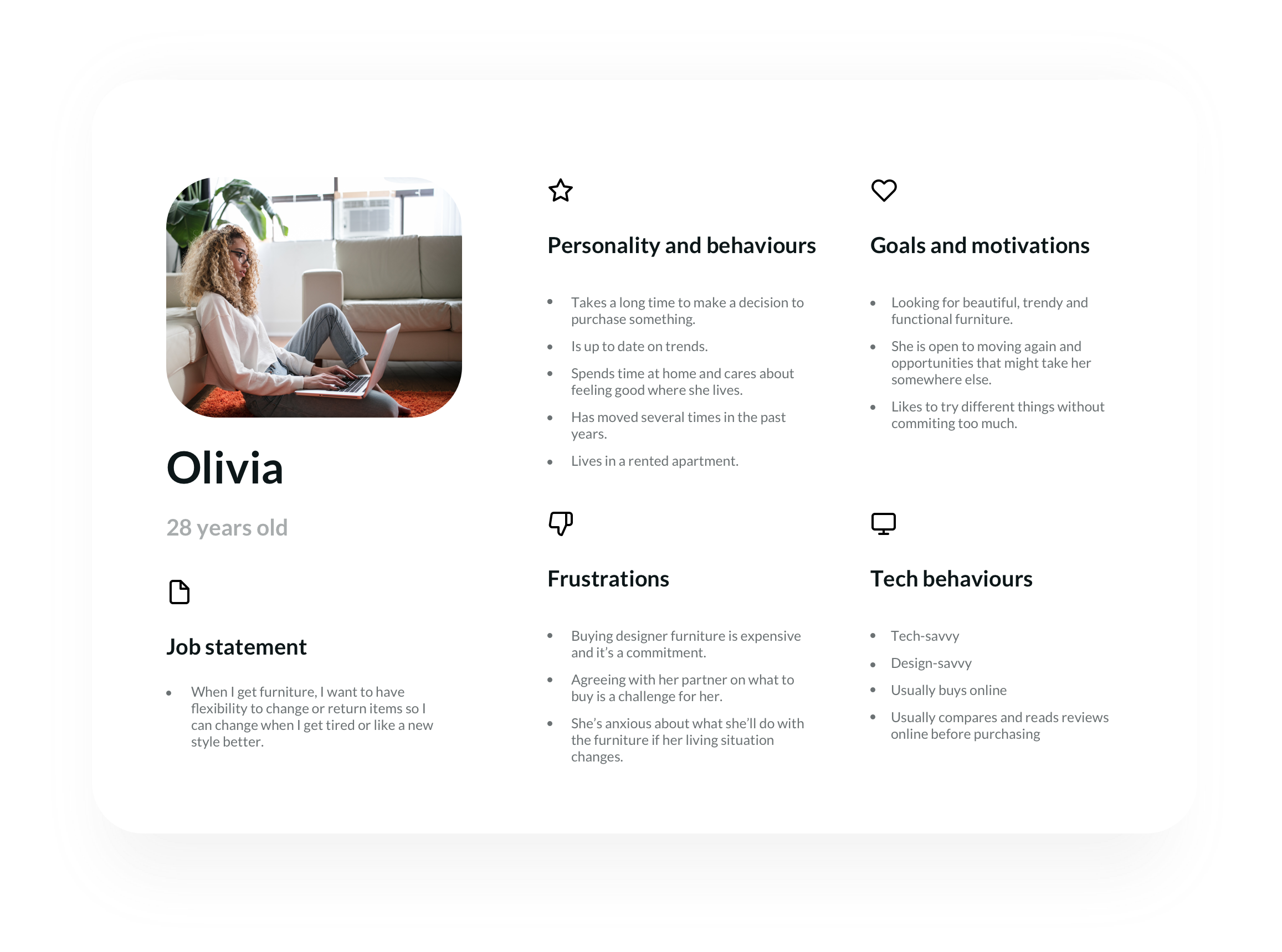
Personas
I created several personas to help me frame the design with a user-focused approach. Then I created several job statements as they’re very useful to get into the mind of your users and what they are trying to get done.
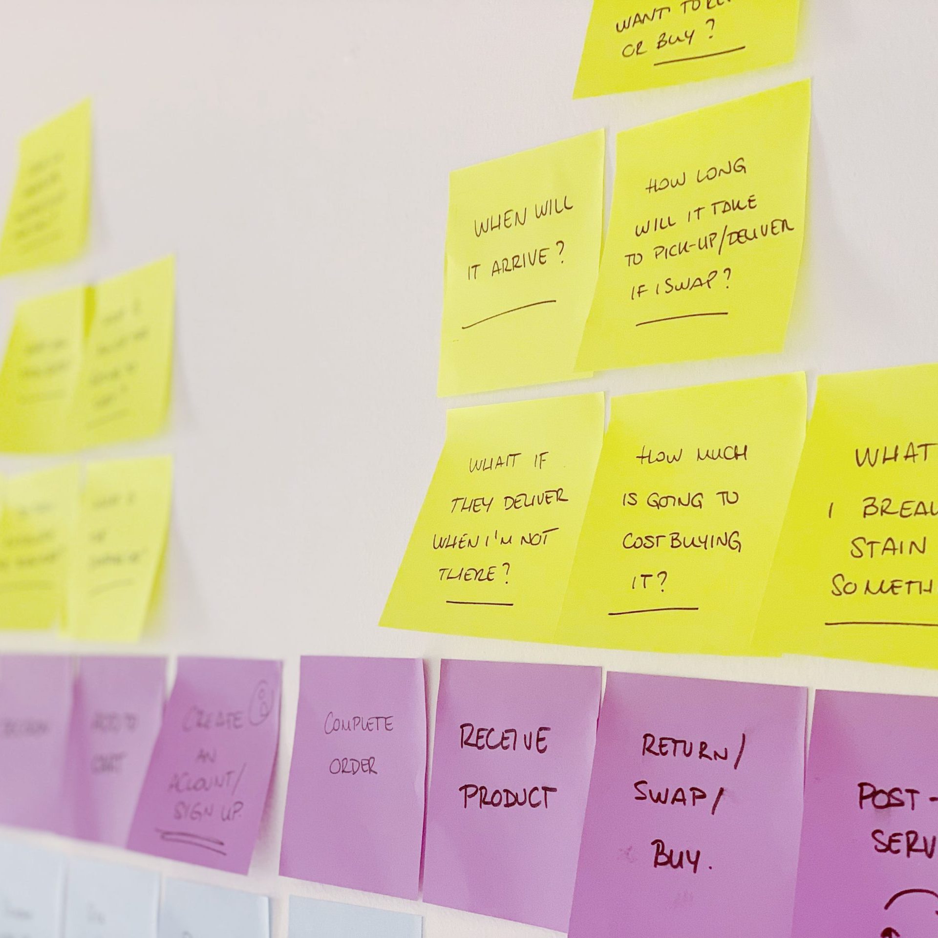
User journey
I outlined the user journey with the different steps and activities the user takes, as well as the questions that arise for them on each part of the flow. For example, as it is a novelty concept many would question “is it trustworthy” / “is it hygenic?” at the first touchpoint, while moving through the funnel will create different doubts, such as “what if I break it or stain it?”, “what’s the total monthly cost?” and “for how long can I rent?”. It came in handy to develop the Information Architecture of the website, complemented with card sorting exercises to better categorize the content.
Low fidelity
I started creating drafts of the web following a mobile-first approach, first a very rough version creating a flow of navigation for the main funnel, then in Sketch outlining the content sections, refining orders and elements, and mapping the different statuses in the UI.
The goal at hand is that the user is able to rent a piece of furniture as easily and frictionless as possible, and this low-fi wireframes helped me outline and organize the interface focusing on helping the user achieve that end goal, instead of the specific UI details which I didn’t need at this stage of the product.
Doing low fidelity first allowed me to generate different ideas fast and make changes in an easier way.

Branding
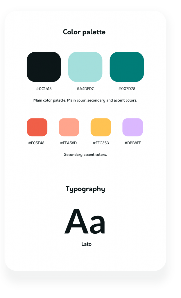
I chose a color palette of teal and dark green tones that reflects:
Freshness: not just another furniture store
Eco-friendliness: with green tones to highlight the environmentally friendly character of the product (reduces waste in renewing the use).
Innovation: it goes beyond simply selling furniture, it’s about adapting to our time and where the future is going
Nordic style: that is minimal and combines elements in darker tones with mostly white.
High fidelity
After some adjustments I moved to creating the brand, choosing a color palette and logo, and crafting the high-fidelity wireframes.
Live prototype
I used Sketch to design each screen and component, then I imported it to Figma to prototype and create the interactions. Figma offers many prototyping options (overlays, animations, etc.) that Sketch does not have.
General
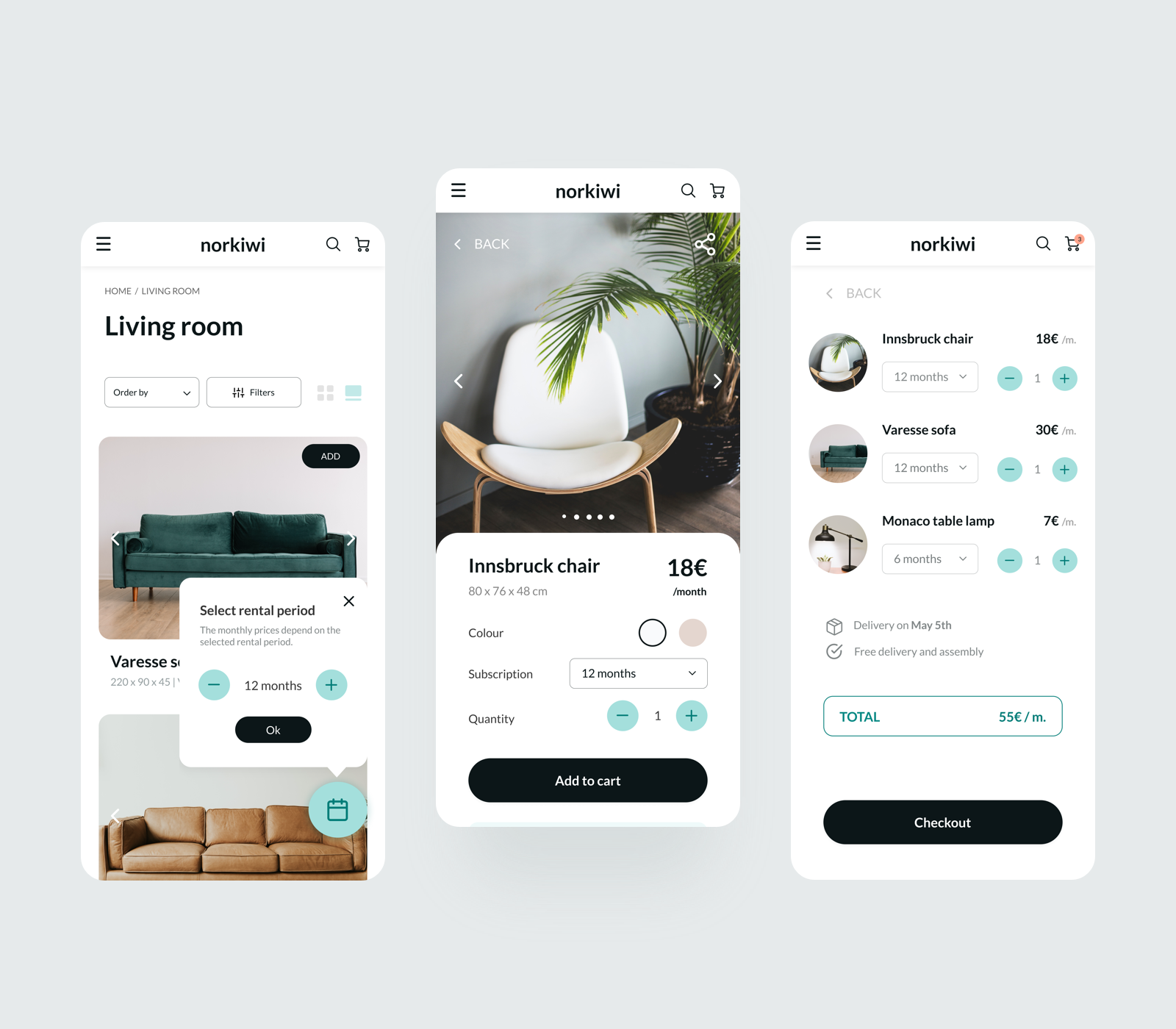
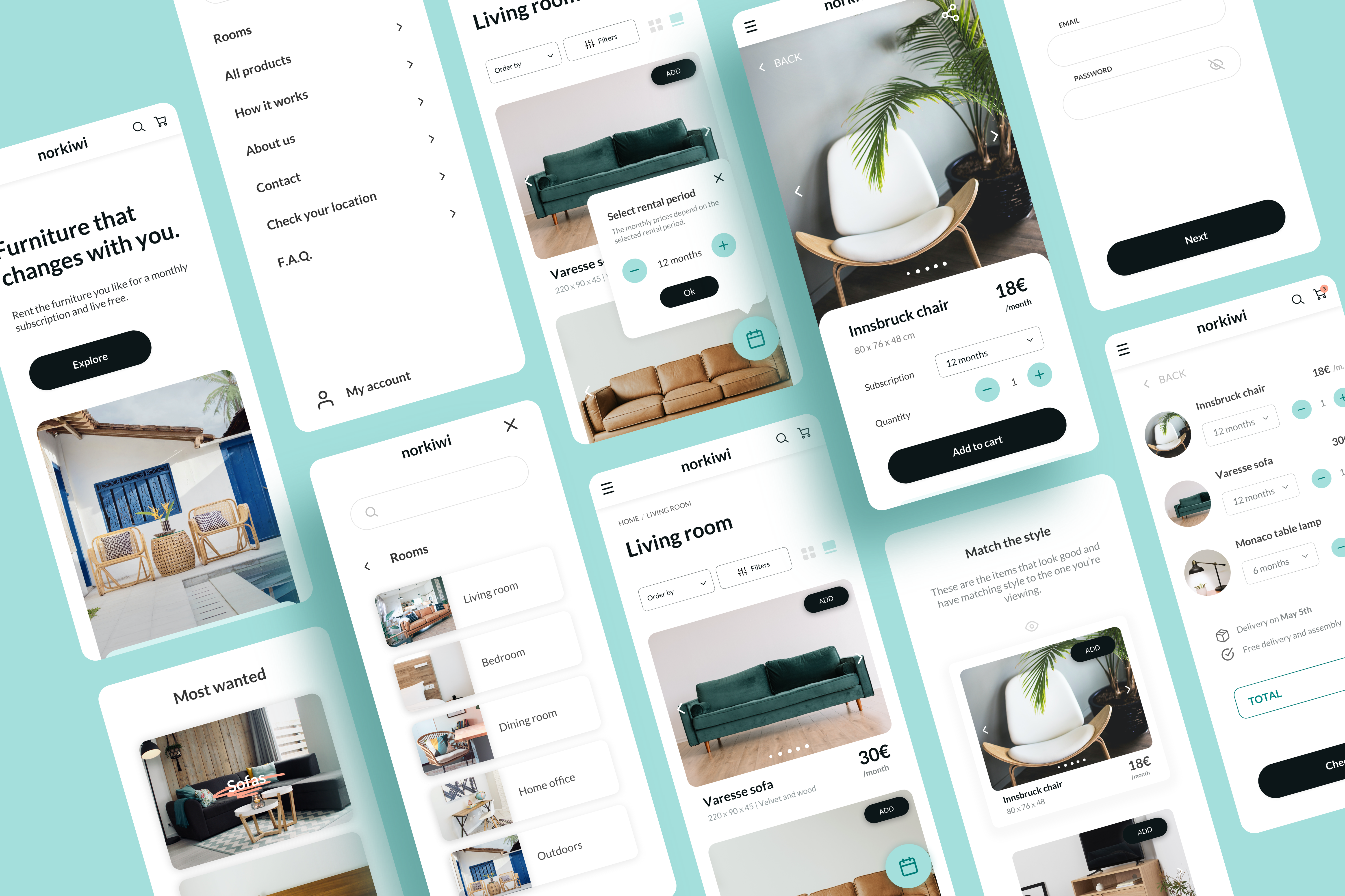
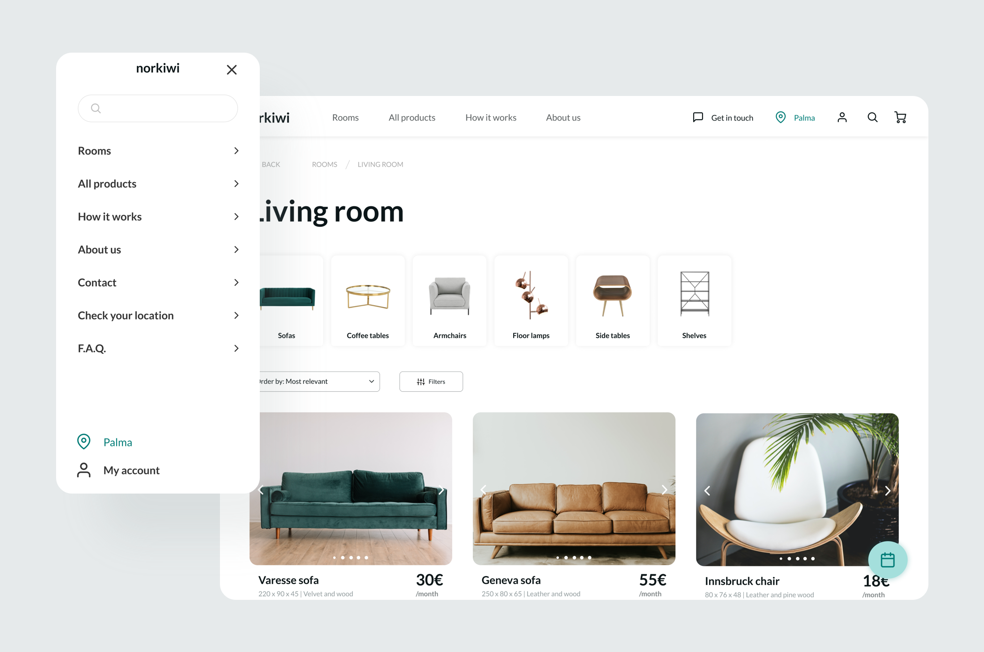
Simplicity: clean interface, where the furniture photos are the main focus doing an emphasis on design. It’s also a way to distinguish from “conventional” furniture e-commerces and conveying the idea that furniture rental is the future and as easy and fast as you’d imagine.
Rounded shapes and soft shadows: with the intention to create a friendly and approachable interface, also putting the emphasis on flexibility (as opposed as many sharp-lined, angular traditional furniture stores).
Large images and in context (no white background): inspirational, as the customer cares about design and it can be useful to decide between similar products.
Button style: primary actions with bold main color, ghost buttons for secondary actions.
Navigation per room: categorizing products both per product type and per room. With a navigation per room, you can help the user discover item types faster and inspire them to get a set of furniture pieces that combine.
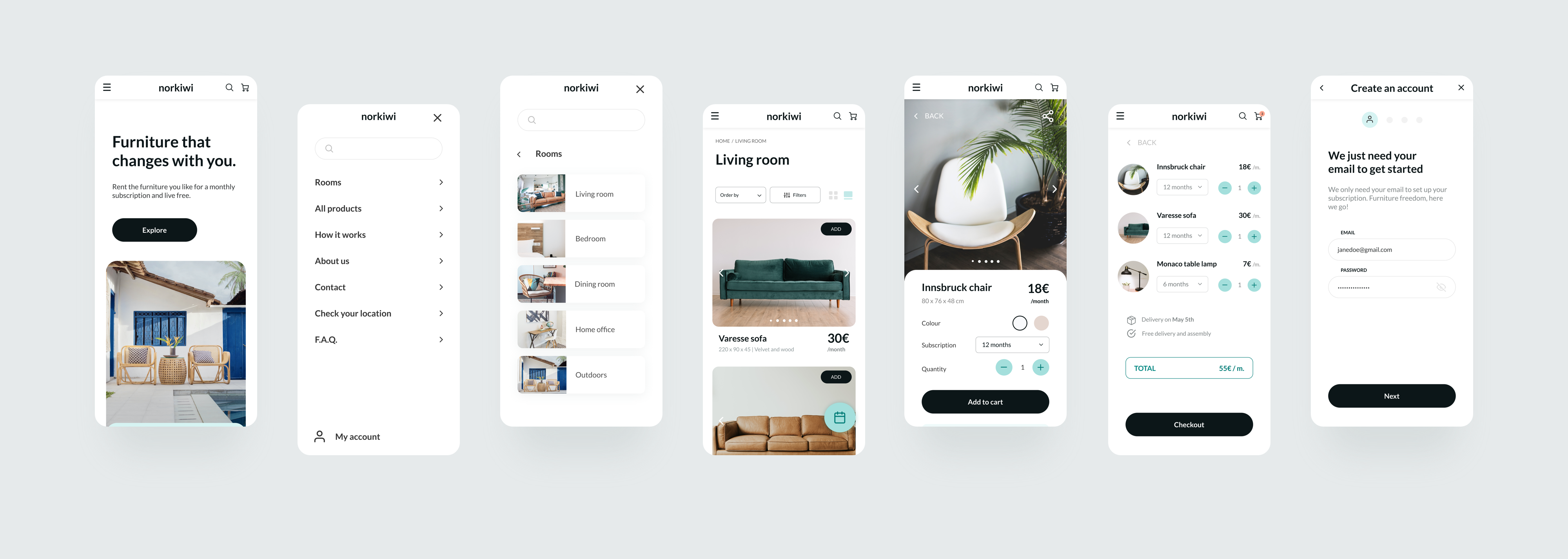
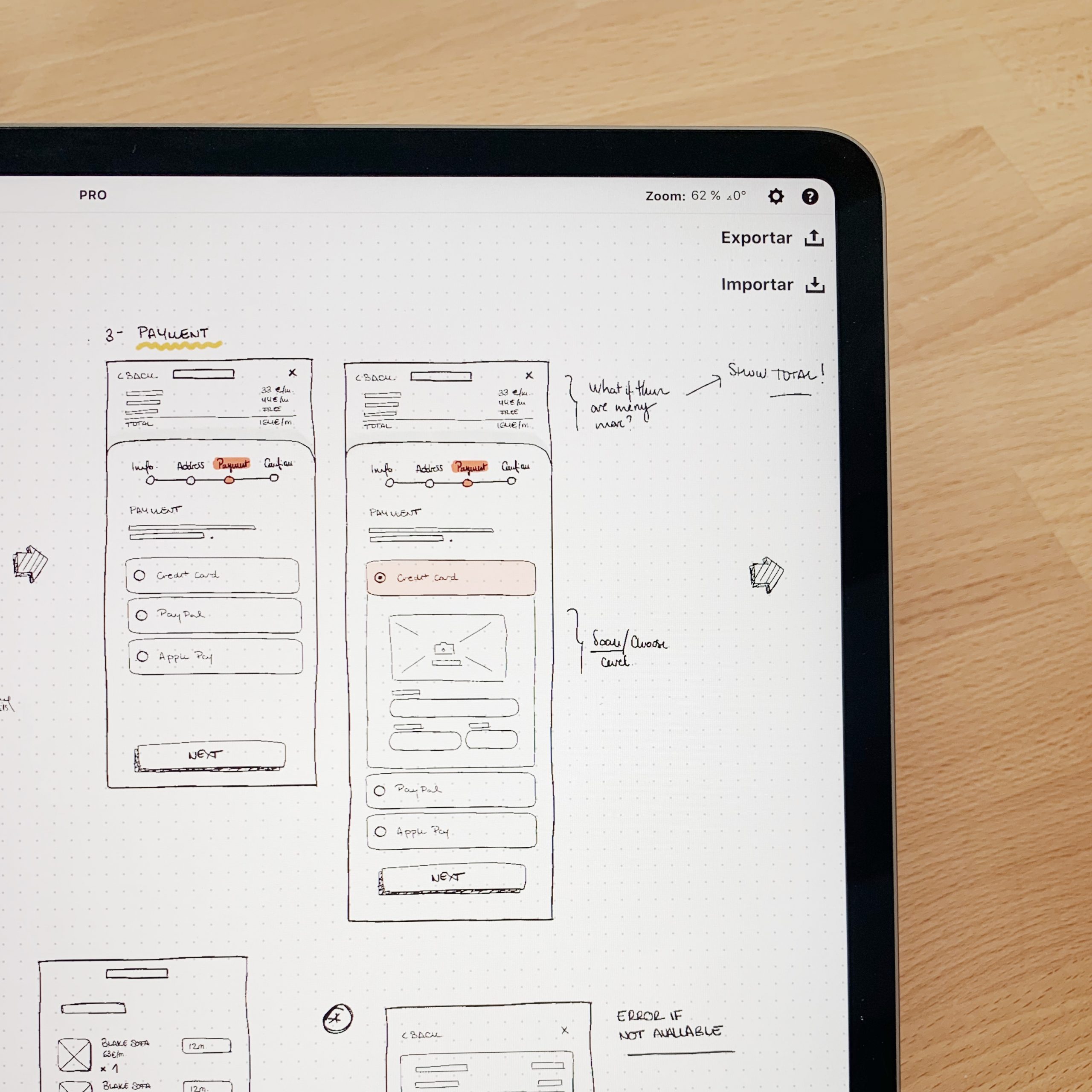
Product page
Rental period selector and quantity as the price changes: the price per month changes with the rental period, so it’s important that it’s as accessible and clear as the quantity.
Stock info – psychological principle? always accurate
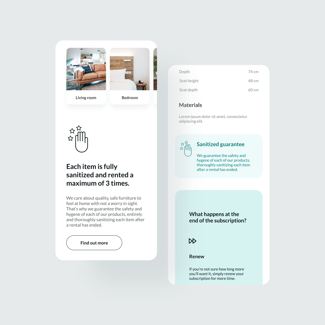
Reinforce choice: the flexibility of rental is emphasized on the product page to let them know what will happen when the period they’ve selected is over, with the intention of clarity and transparency.
Match the style section: to help the user decide faster, there’s a recommendation of things that look good together.
Cart checkout
Step by step: marking each step visually and outlining the full checkout process, giving the user feedback and keeping the focus on it (reduced navigation: they can close or go back).
Visible products: on each step the products added to cart are visible (summary).
Scan card: to facilitate the payment input.
Key iterations
I focused on obtaining feedback and going back to analysis when creating the prototype.
Home page – How it works
Thanks to research insights, I realized this product is a novel concept for many potential users and can cause some insecurity on the decision making process and slow down the aha moment, which I assumed can also impact conversions in the long term.
I had to reduce the uncertainty and doubts around this. So I changed the home page to include and give visual prominence to a “how it works” section, with a new copy that explains in 3 simple steps the process. Also with a link to an extensive FAQS page to solve any other frequent doubts. I also included a small section at the bottom of the page for the most frequent questions.
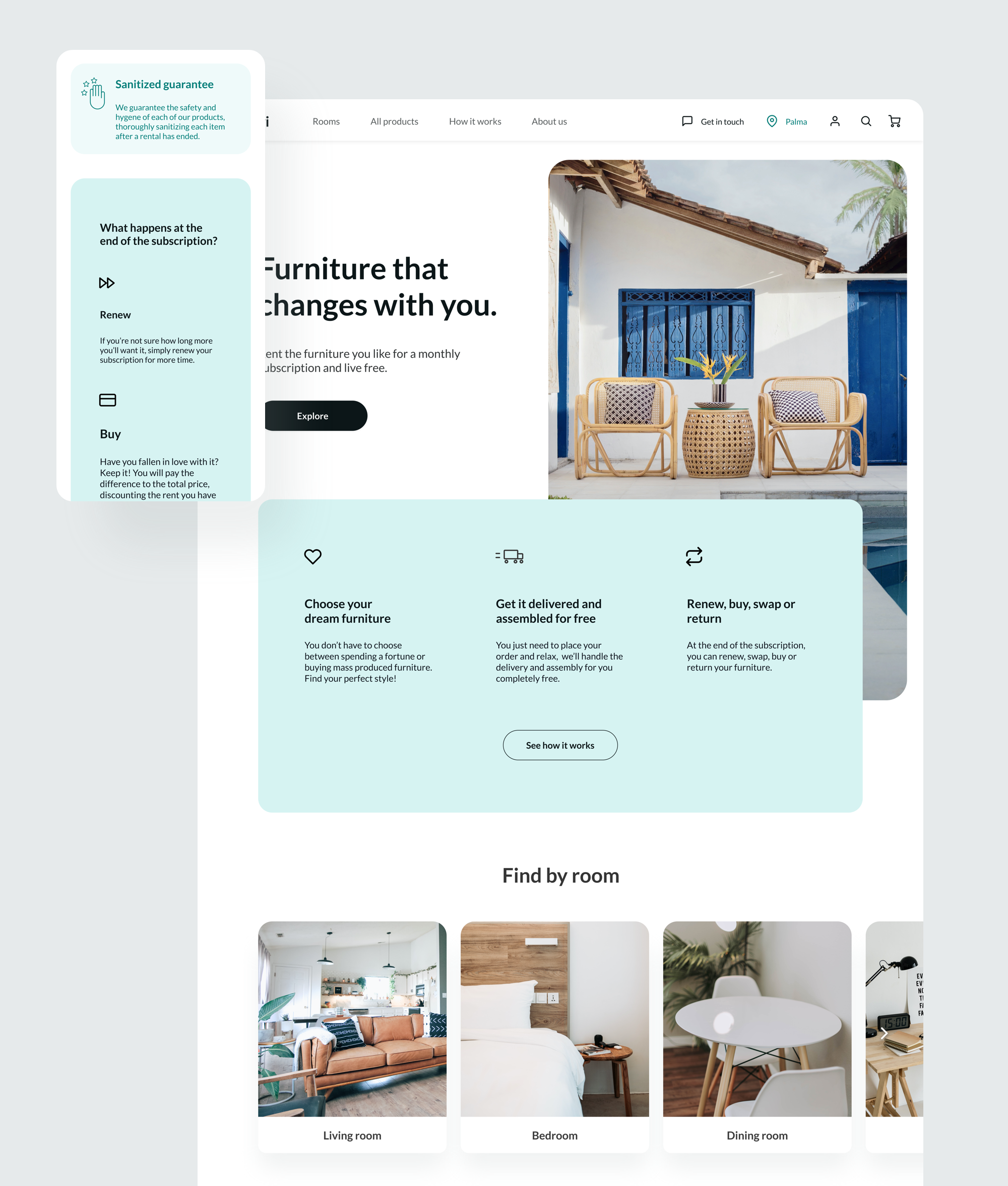
Location selector
As I assumed the constraint that at first the service would not be available on all national territory but a selection of cities, it’s important that the location availability is noticeable and warned when not available.
On the first iteration, the selector was at the bottom of the home page. This was not efficient: what if the user accessed the web from another page and then only realized the service was not available when adding to cart? I didn’t want to include an overlay when reaching the page either, since it’s very obtrusive for the experience. So I decided to put in on the header menu, using the browser’s native location by default and accessible.
After-COVID update
When COVID appeared, I understood it’s likely health safety is an issue that could put off users from renting furniture, so I had to reinforce the measures to protect them.
Measuring the outcomes
With a fake-door test I could validate if there’s interest and intention from the potential customers, without needing to get the inventory of furniture upfront. There’s a need to track the key funnel KPIS to measure a real intention to buy:
Visits to website > Searches > Add to cart events > Checkout churn > Conversions (confirm order)